This is my sketch. I plan on making some lettering in it as well to signify that it is my brand.

210 or not 210

This is my sketch. I plan on making some lettering in it as well to signify that it is my brand.
Here are my completed Illustrator tutorials.


I decided to create an advertisement for a Playstation controller. Through this project, I wanted to work on my lighting and composition skills. Working with a nonorganic model has its benefits, and they’re always good practice. Inorganic models, of course, cannot move, which means that I can take photos with a lower iso. Especially in low light, it makes things a lot easier.
I chose a Playstation controller because it’s easily movable, and it has some cool textures on it. It also has an internal light source, which you don’t see in most products.
For the pictures of the controller, I lit it using some of the strip led lights in my room. With a person, the photos would have come out a lot more blurry/ grainy. However, by the end of this semester, I want to experiment with portrait photography with similar lighting.
For the first draft, I was inspired by looking at modern-day advertisements. I’ve noticed that a lot of them utilize complementary colors, which I did with the red and the blue, and have minimal usage of text.
The shapes on the side of the advertisements are the same shapes on the PlayStation controllers, and have been used in many Playstation ads. I wanted to include that element to remind readers that it is a Playstation controller, because some of the shapes are hard to make out at first. Showing the shapes reminds readers of what they’re looking at.
Instead of using pre-made shapes from the buttons, I recreated each shape myself to avoid copyright infringement. I also made the weight of the lines slightly bigger.
I took the photos in my room using the lights under my desk, and a secondary light to the side of the controller. I changed the light color to blue, and red for the secondary light. I wanted to use the red secondary light to give it some depth and visual interest. For the one photo without red in it, I turned off the lights in my room and held the controller up to the mirror.
I then edited all of the pictures separately in Photoshop for the first draft. I mostly just edited the hues, saturation, and levels. However, with the image of the controller in the mirror, I did some more editing on that in particular. I masked the controller from the mirror in the background with the smart object selection tool, selected the inverse of the image, deleted the background which made a png, and filled it with the bucket tool.
I then cropped the images into a square except for the background image, and put them all into one image. I then lined them up with each other, resized them so they were all the same size, and positioned them so each side of the image has equal weight.
I then added text and created the shapes for the right side of the image. The triangle was more difficult to make, but not by much. With the other images, you can just click on the shapes dropdown menu, and select the shape. There is no preset for creating triangles, so I just used the polygon, and defined the shape as a polygon with three sides.
For the first draft, I was pretty happy with the way that it turned out. However, when I started working on the second and final draft, I realized that there were a lot of little things that I overlooked.
Some of the feedback that I received was that I should try to change the format for the pictures, including lightening up the images and differentiating them from the background. I was also told that I should consider moving the smaller boxes around on the image.
In the images that I took of the controller fall under fair use. The PlayStation button is not visible in any of them.
For my final project, I took this into account. I edited each image to brighten it up, which made it look a lot better and more clear. I also shrunk the images to take the focus off the images, and more on the background. I then took the three images and put them in the upper right-hand corner. I also changed the font to make it more readable.
I also changed the color of the shapes to black, which made it so I could not see them, due to the low contrast shadows in the background. I had the idea of making a white rectangle to put behind the images, and I liked how it looked. I then decided to make it wrap around the rest of the image and connect to the text at the bottom of the screen.
When I did this, the boxes overlapped the focal points of the image. To fix this, I created a cutout of the hand and controller, so I could put the rectangle banner in the background. I then created a drop shadow effect on the hand and the boxes to put some dimension on the image and to show that it was separate from the background of the image.
I really like the way that this project turned out. The feedback from other students was extremely valuable, and it helped me to see what I could improve on.
All of the images in this project were created and edited by Joseph Gardner during September 2019.


I decided to create an advertisement for a Playstation controller. Even though this isn’t necessarily portrait photography, I’m working on my lighting and composition skills. Working with a nonorganic model has its benefits, and they’re always good practice. Inorganic models, of course, cannot move, which means that I can take photos with a lower iso. Especially in low light, it makes things a lot easier.
For the pictures of the controller, I lit it using some of the strip led lights in my room. With a person, the photos would have come out a lot more blurry/ grainy. However, by the end of this semester, I want to experiment with portrait photography with similar lighting.
I was inspired by looking at modern-day advertisements. I’ve noticed that a lot of them utilize complementary colors, which I did with the red and the blue, and have minimal usage of text.
The shapes on the side of the advertisements are the same shapes on the PlayStation controllers, and have been used in many Playstation ads.
I took the photos in my room using the lights under my desk, and a secondary light to the side of the controller. I wanted to use the red secondary light to give it some depth and visual interest. For the one photo without red in it, I turned off the lights in my room and held the controller up to the mirror.
I then edited all of the pictures separately in Photoshop. I mostly just edited the hues, saturation, and levels. However, with the image of the controller in the mirror, I did some more editing on that in particular. I masked the controller from the mirror in the background with the smart object selection tool, selected the inverse of the image, deleted the background which made a png, and filled it with the bucket tool.
I then cropped the images into a square except for the background image, and put them all into one image. I then lined them up with each other, resized them so they were all the same size, and positioned them so each side of the image has equal weight.
I then added text and created the shapes for the right side of the image. The triangle was more difficult to make, but not by much. With the other images, you can just click on the shapes dropdown menu, and select the shape. There is no preset for creating triangles, so I just used the polygon, and defined the shape as a polygon with three sides.
All of the images in this project were created and edited by Joseph Gardner during September 2019.

For this project, I am going to create a modern advertisement for my Playstation controller, using photos that I have taken.

Here are my completed tutorials.

My topic is portrait photography. I love doing portrait photography as a hobby, and I want to push myself to do it more and improve on my skills.
I’ve been doing photography since middle school, but it was only last year that I got really interested in portrait photography. I started working at the Daily Evergreen. While I was there, I realized how much I love taking pictures of people.
I started doing photoshoots outside of work, and I had a lot of fun. I’ve learned a lot about posing models and working with models that aren’t usually comfortable with having their pictures taken.
However, I still have a long way to go. I want to experiment more with posing models in an artistic way, and I want to work on using lighting intentionally.
This semester, I plan on collecting photos from shoots that I do. I also want to try to document the actual photoshoot process better. I want to experiment with taking photos of myself during the photoshoot process. I might do this by asking a secondary to come and take pictures of me. I can also use my own photos from shoots in my blog posts.
I’m also planning on recording and documenting my editing process. I can do this with Quicktime player. I’m also thinking about setting up a microphone and talking through the process while I edit. Using this method, I can also talk about the details of the actual shoot.
During the shoots, I can take a video of the process vlog style. I haven’t vlogged in the past, so I’m excited to try it out!
In Com 210, we have four unit projects. The first project focuses on using Photoshop. For this project, I’m thinking about doing a photoshoot and editing it with photoshop and experimenting with surrealism.
For the second, we’re asked to create a logo for something in Adobe Illustrator. I’m going to make a logo for my Instagram photography page. I’m a fan of minimalism, so I’m thinking about trying to replicate a camera lens in that style.
Throughout the last week, I have been collecting links for inspiration on portrait photography. Pinterest has been very helpful in doing so.
http://www.brandonwoelfel.com/photography-1/fiysv6tcc92x42yt5vzls4xryxgep6
This is one of the photos that I found inspirational. The photographer’s name is Brandon Woelfel. I really love the usage of lighting, and I want to try to emulate this in one of my next projects.
https://www.getfractals.com/creative-photography-techniques
This is a blog that I found with some interesting photography techniques. I really like the photo where they used a CD to create some interesting lighting effects.
https://www.instagram.com/druephoto/
This is a photographer that I find very inspirational. His photography is unique and well done, and he posts behind the scenes photos on his Twitter.
For those who came before me, and those who will come after.
— Fred Stimson
Hello! My name is Joseph, my pronouns are He/Him/His, I’m 19, an Aries, and I’m a Sophomore at Washington State University. I’m a Multimedia Journalism and Digital Technology and Culture double major. I’m a Sponsor at Stimson Hall, and I worked as a Photographer for the Daily Evergreen last year.
The purpose of this blog is to post assignments for a class that I’m taking this semester, Com 210, and for myself to try blogging out! I will be posting photos, videos, and audio to this page, all created by myself.
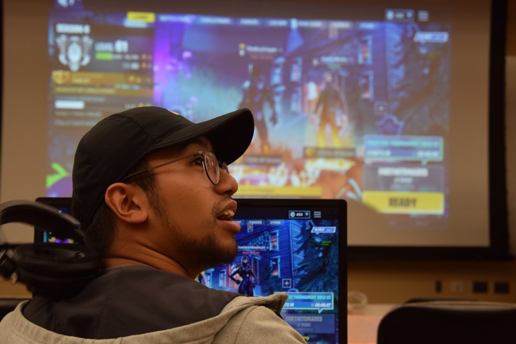
School aside, I love to watch movies and photography. I mostly do portrait photography, but I want to get more into nature photography. I love horror movies. The first movie that got me into horror was Alien. I then watched The Shining and Poltergeist, and I was hooked. My favorite movie is Hereditary, which I’ve watched over ten times. I also love gaming. I like single-player games, because it’s less pressure than multiplayer stuff. My favorite overall game is God of War for the PS4.
I would love to shoot and edit documentaries sometime in the future. I enjoy working behind the scenes. I would particularly like to work for Vice, because I love their work and I like the general feel of the company.
